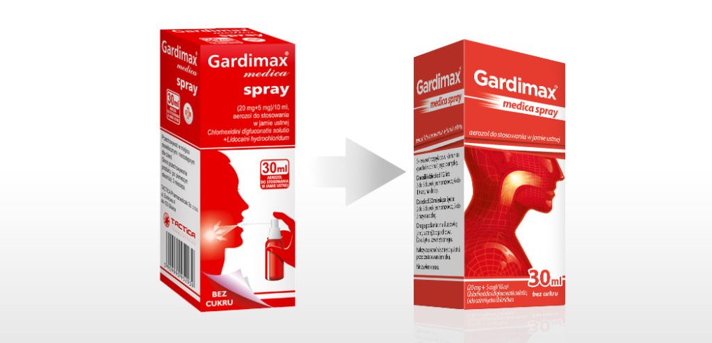
Gardimax – packaging refreshing
In the existing packaging, the illustration styles varied slightly, and the Gardimax Spray box featured a hand and a bottle. Our solution was to use the same illustration without showing the method of application on the front of the box. Additionally, we refreshed the product logo to give it a sense of calmness and increased stability.
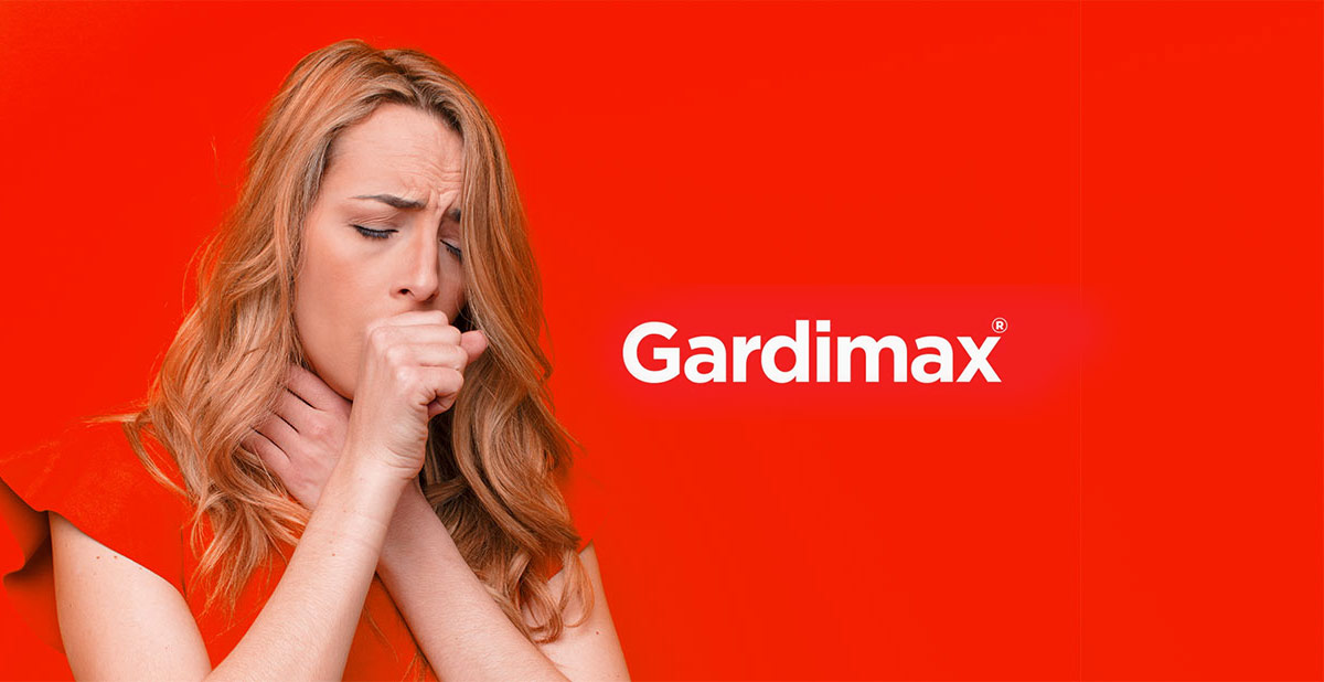
Breathing new life into a long-standing, well estabilished product:
How do you attract new customers without losing the existing ones? This was the challenge when Tactica Pharmaceuticals approached us with their flagship product, Gardimax. The first thing we did was identify the key features of the existing packaging, the so-called core. In this case, it was the color scheme (red and white) and the product name. The rest of the elements were essentially add-ons.
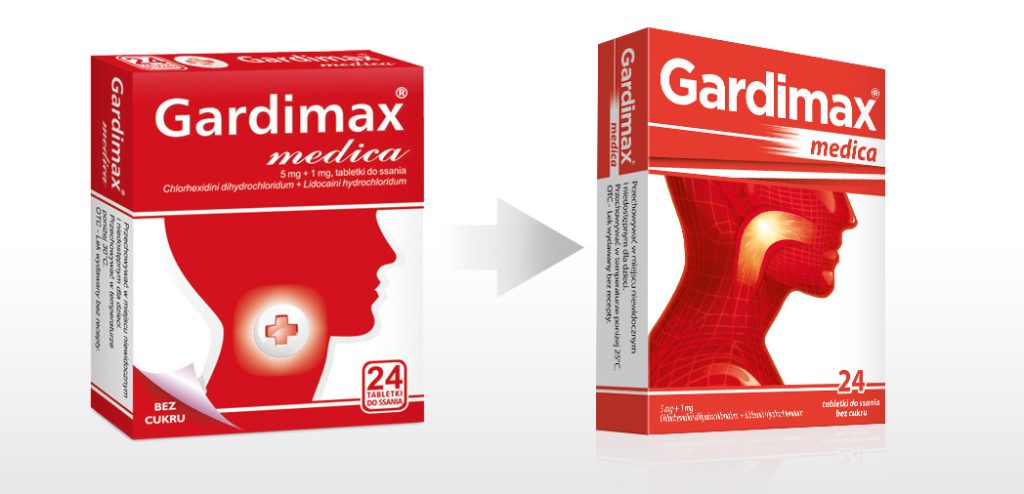
Next, we pinpointed areas where changes could and should be made. This included a facelift for the Gardimax logo, information hierarchy, and the illustration on the front of the packaging. After careful font selection and determining the appropriate spacing (kerning) between letters, we designed the new Gardimax logo, immediately pairing it with the additional text SPRAY. The color scheme of the packaging was also subtly altered, using an intense PANTONE 179 C. This ensured that the packaging would be immediately recognizable on the shelves.
The most crucial element of the new packaging was a change in information hierarchy.
We removed all distracting elements around the logo. We got rid of the outdated “folded paper” effect, and the sugar-free information was placed beneath the tablet quantity. Lastly, we changed the illustration. The old, schematic illustration of a human head was replaced with a modern and attractive one. Additionally, we better highlighted and emphasized the product’s action.
Developing the illustration required a deep understanding of anatomy and serious consideration of how to visually and clearly show the product’s action. After creating a series of sketches, we selected the ones that best fulfilled their purpose and presented them to the client for selection.
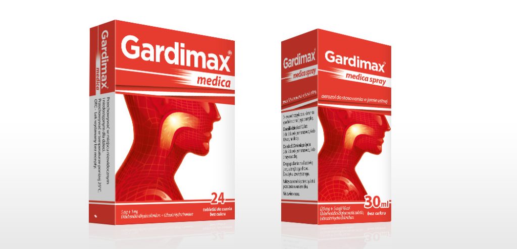
In the end, our ideas were enthusiastically received by the client, and we proceeded to refine them. Thanks to these efforts, the packaging formed a cohesive line. This is how we successfully refreshed the packaging, maintaining its original character while making significant changes and modernizing it.