Paprocky – Single Malt Whisky
Product overview
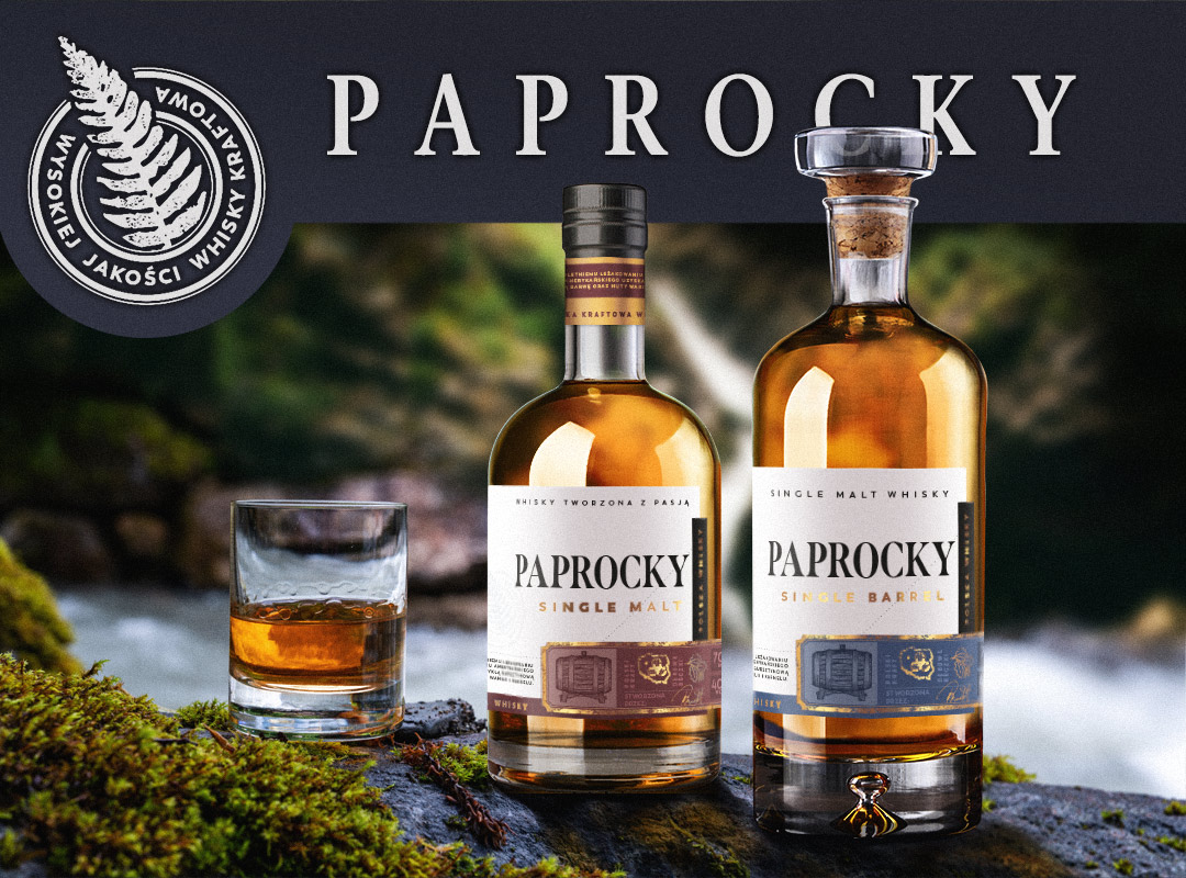
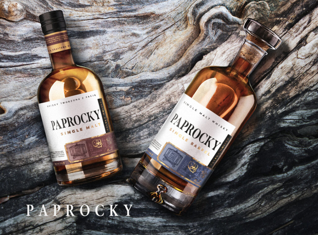
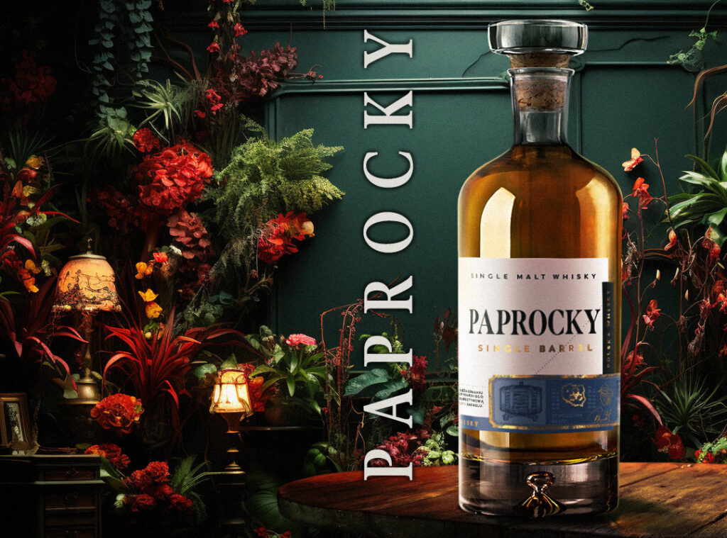
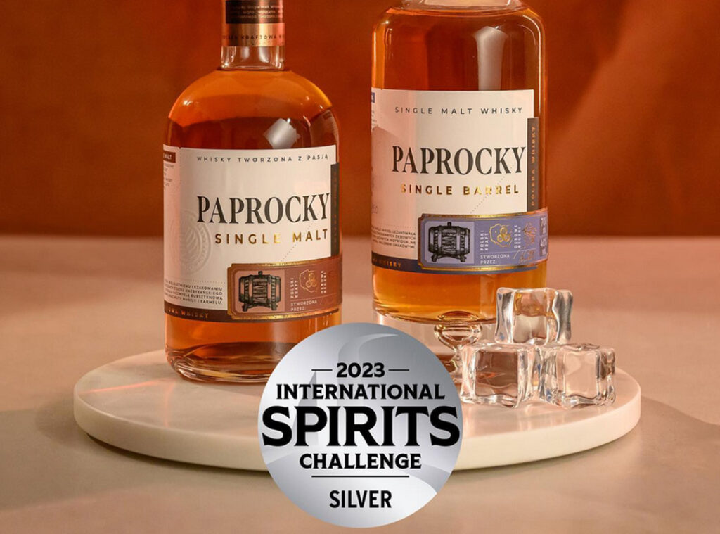
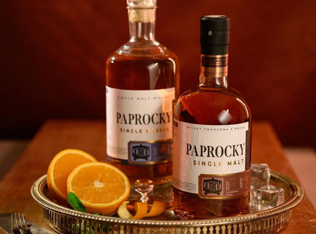
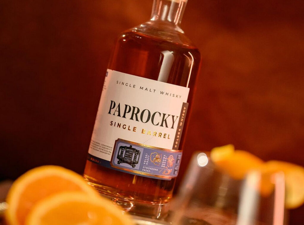
Bartex Bartol, a prominent player in the Polish alcohol market since 1990, entrusted us with the challenge of crafting a label for Paprocky, a unique whisky aged in oak barrels. Each bottle features a manually written barrel and bottle number, embodying an unconventional philosophy that demanded an equally distinctive label.
Challenges faced
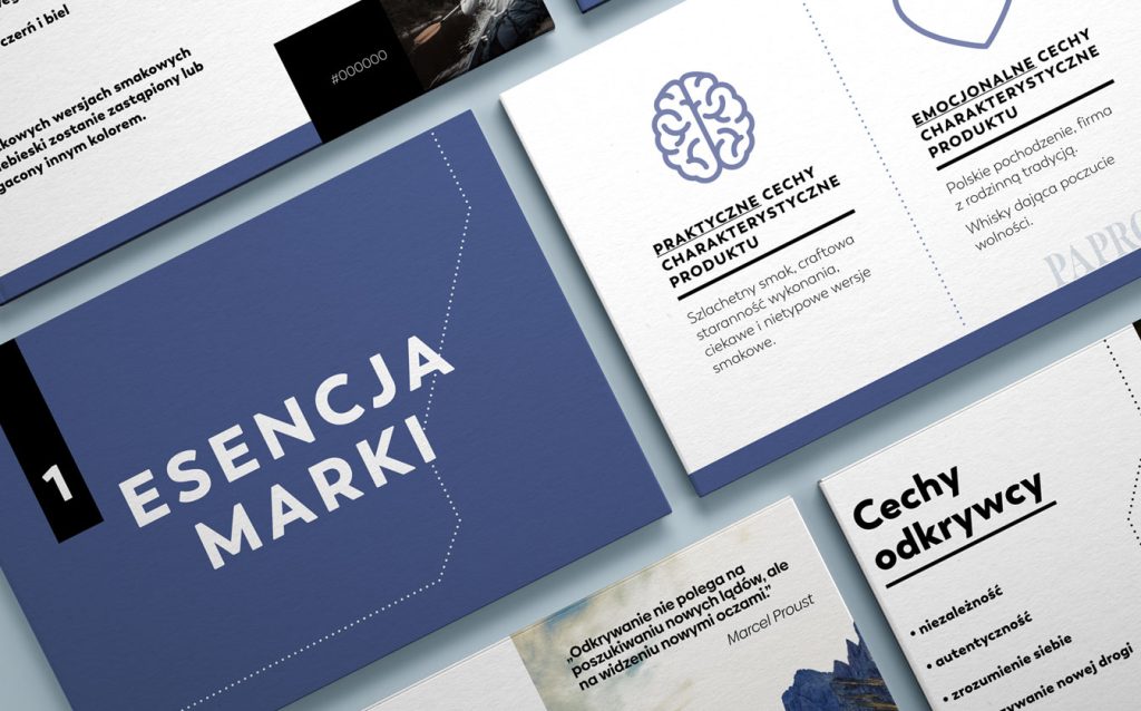
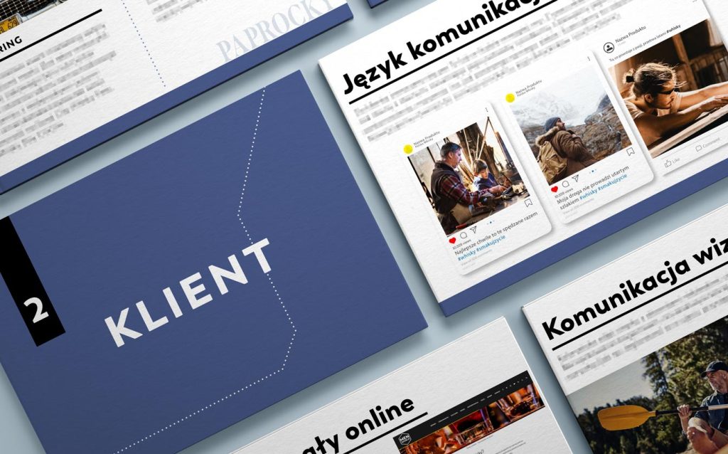
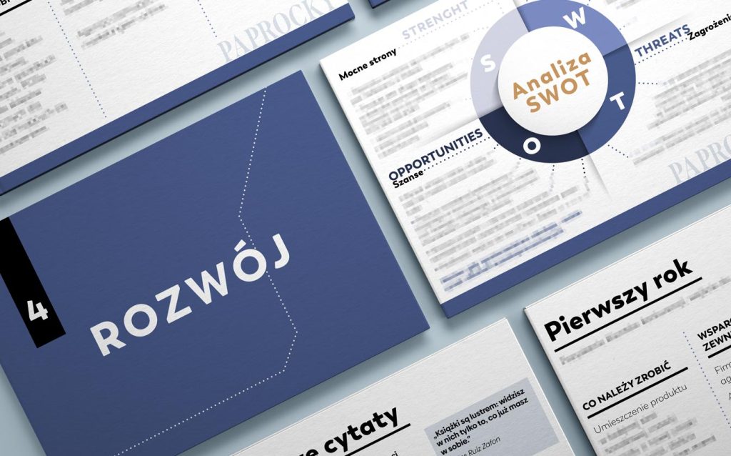
Our journey commenced with the development of a comprehensive marketing strategy, including naming, persona creation, and brand archetype definition. A SWOT analysis, color scheme determination, and advertising slogan creation followed. We meticulously outlined product usage scenarios, customer expectations, and perceptions of whisky in general as well as this particular whisky with polish origins.
Strategic insights
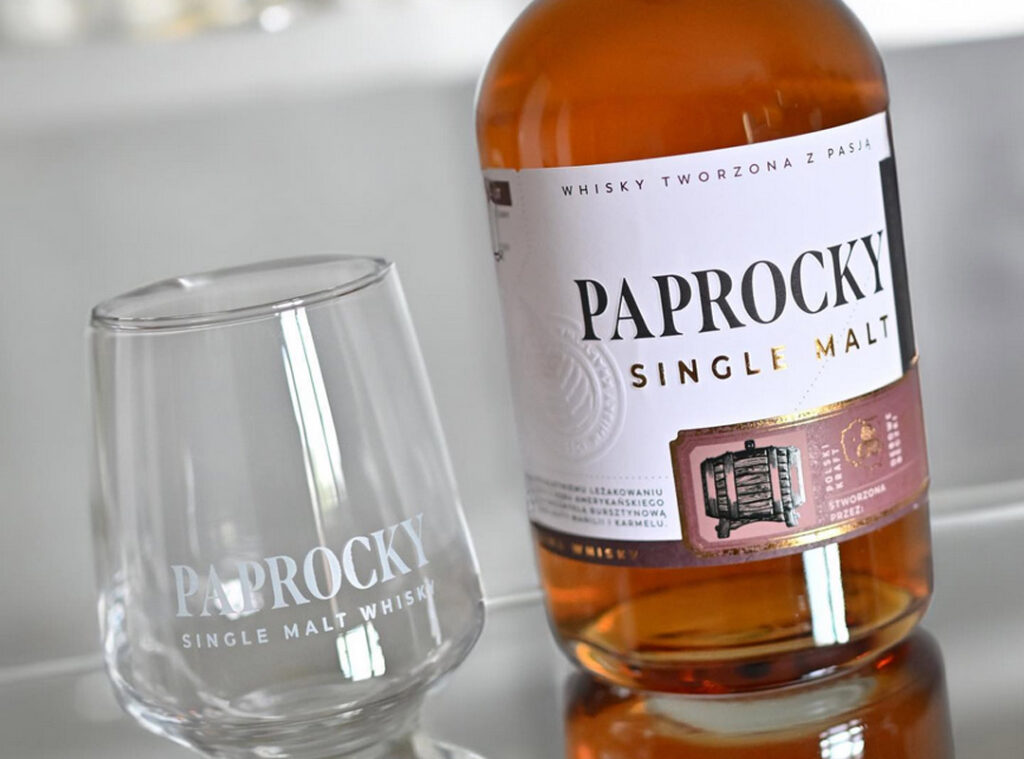
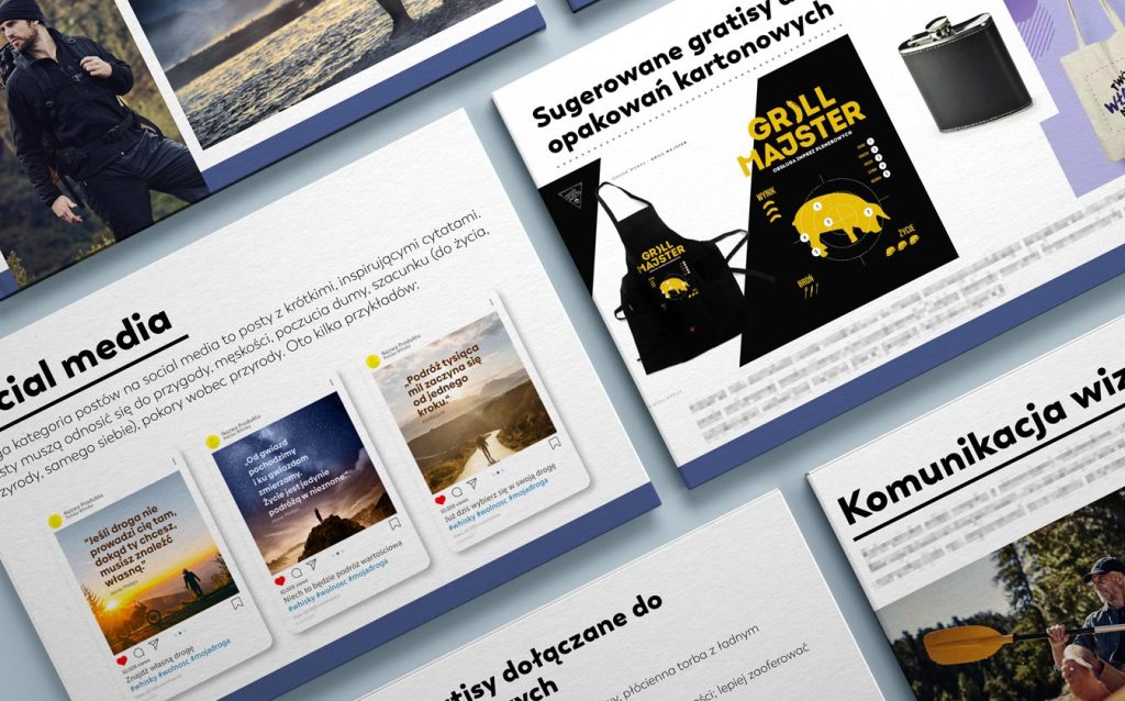
We also delved into what and who influences purchasing decisions, organizing these factors based on their impact on customers. In the further part of the strategy, we proposed the best Points of Sale (POS) and gift packaging. We examined catalogs of promotional gadget manufacturers and, out of thousands of options, selected those that would truly resonate with the target audience. Among them, for instance, are an apron for the grill master, an elegant flask, a compass, or a wooden phone stand. It was important for us not to suggest clichés like a USB drive or a promotional lanyard. If it’s a notebook, it’s only high quality. If it’s a glass, it’s dedicated to whisky.
Customer engagement channels
Our meticulous approach to reaching customers involves a strategic blend of online and offline channels. We methodically identified specialists within the industry, ensuring their reach and reputation align with our brand standards. Notably, we purposefully avoided collaboration with inexpensive influencers, prioritizing authenticity and brand alignment over cost considerations.
We pinpointed influential websites and portals with whom collaboration would yield maximum exposure. In addition to our online strategy, we incorporated innovative ideas from Below the Line (BTL) category.
Future directions
We provided forward-thinking insights for website development, social media promotion, and sample posts.
Tone of voice, ideal photos, and shareable quotes were defined, culminating in a comprehensive Brand Development Strategy spanning six months, one year, and three years.
Whisky label design
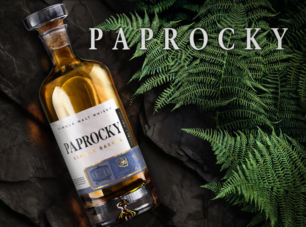
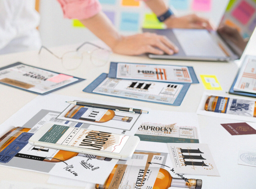
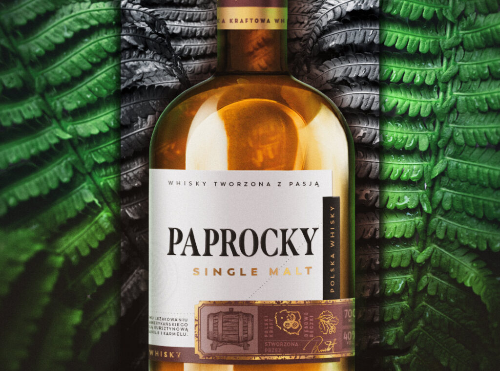
Navigating the challenging landscape of whisky label design, we aimed to set Paprocky apart without sacrificing clarity.
Our creative process involved developing multiple designs based on a strategic foundation, refining two graphic directions, and selecting the final design after extensive consultations.
Creative process
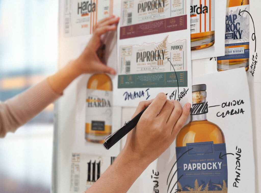
Navigating a challenging legal landscape with extended trade name registration, we explored various product names and crafted diverse designs aligned with the strategy and client’s needs.
Engaging in collaborative discussions, we assessed each concept’s effectiveness, refining iteratively based on client feedback. This adaptive approach resulted in a final design.
Design refinement
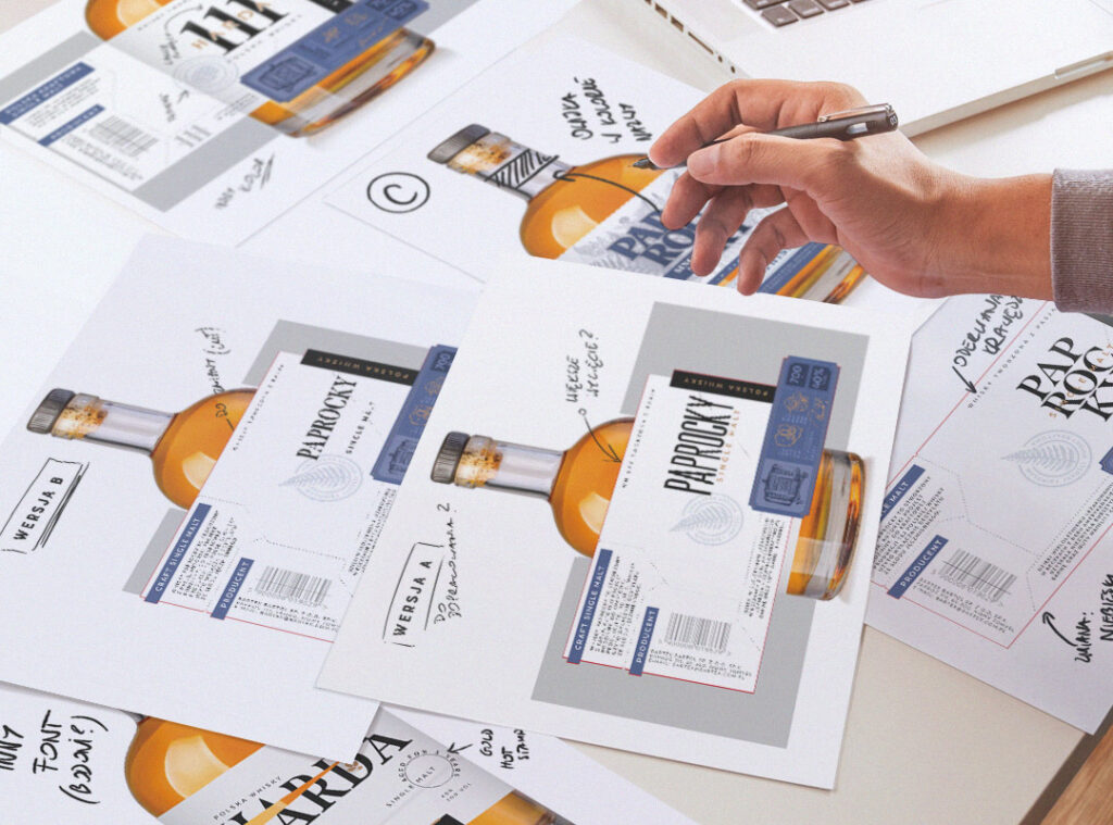
Two graphic directions were chosen, refined, and clarified through consultations with the client.
Alternative fonts were explored to achieve optimal typography. Despite initial challenges with the trade name registration, the selected design remained true to our original proposals.

Market success
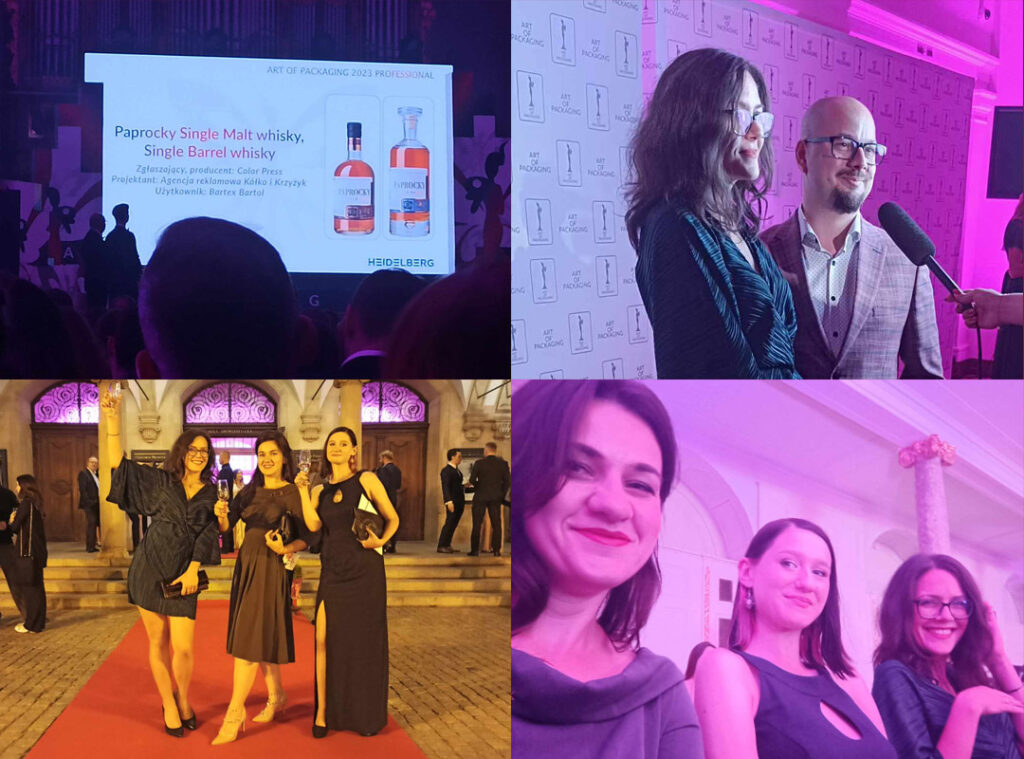
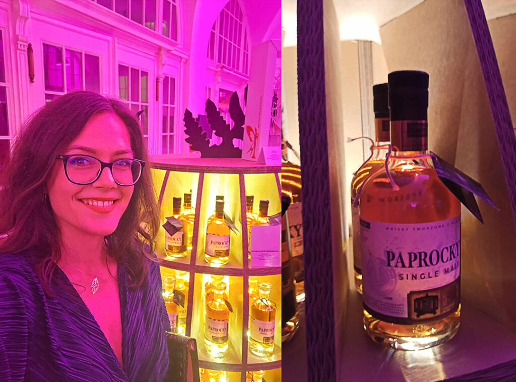
The outcome of our efforts translated into remarkable success—Paprocky achieved sales success, entered Lidl stores, got positive reviews on various platforms, and expanded its brand with additional capacities. The pinnacle of achievement was the Art of Packaging 2023 Award in the Premium category. What’s more, based on it, the Adams company developed a barrel-shaped display, which won an award in the POS category and then the main Art of Packaging 2023 award.
The label’s success extended to the World Star international packaging competition organized by the World Packaging Organisation.
Let’s create something great together!
Request a free quote.
Kontakt
Similar projects
