1, 2, 3… SKIN! Cosmetic packaging
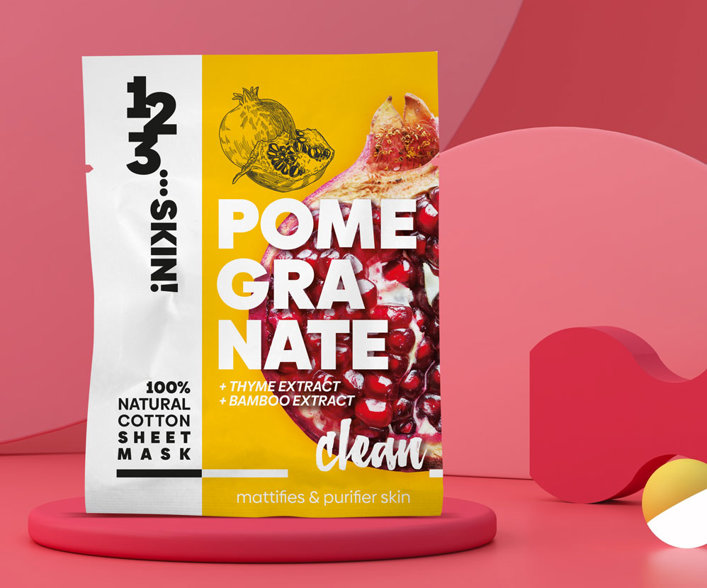
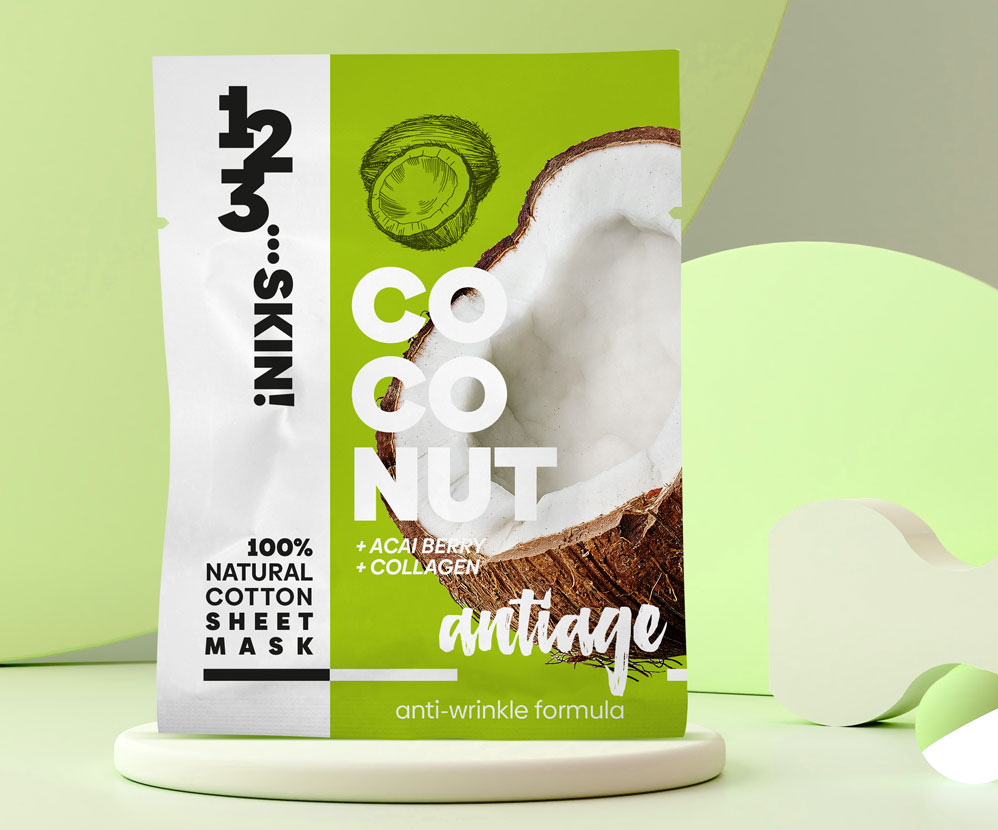
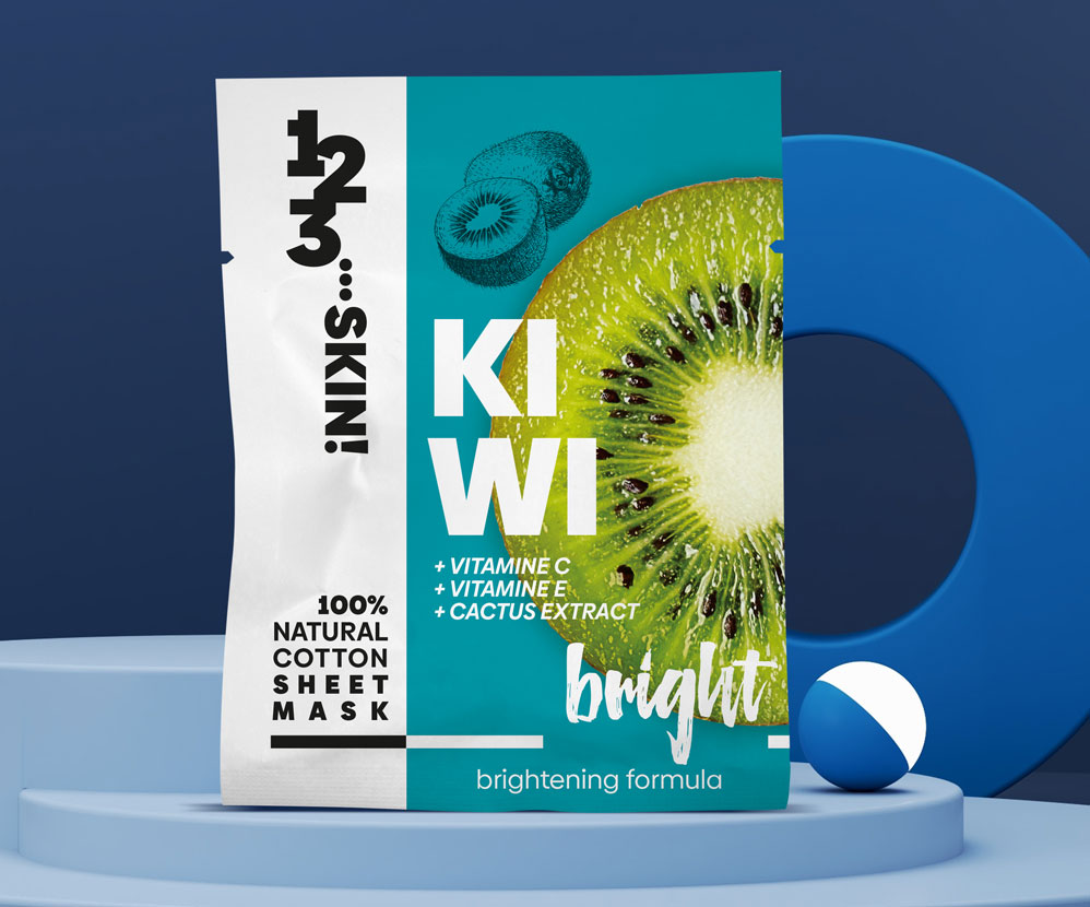
Colorful, bold packaging with striking photos is the visual concept that sets these projects apart from the competition. Due to the target audience (20-35 years old, moderately affluent, educated, curious about new products), we could afford a bold design, slightly breaking away from the mainstream. The key was to create a distinctive design that would be visible and recognizable in a crowded market. The project is characterized by three key elements: a vertically written logo, a striking background color, and an appetizing photo of a key ingredient. These are complemented by additional information strategically placed not to distract attention from the most important elements. Designing packaging for 1,2,3… SKIN! cosmetics is not the only thing we’ve done for this brand.

Brand logo design
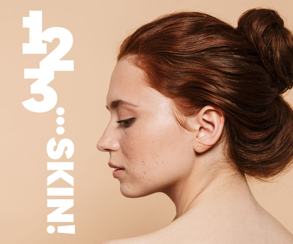
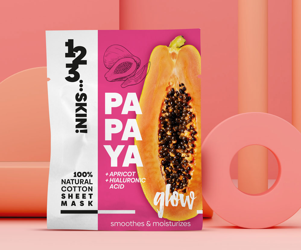
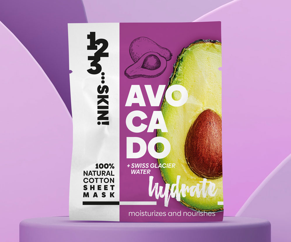
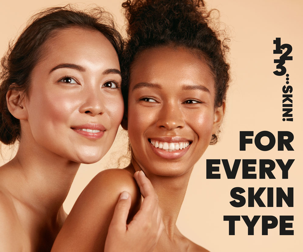
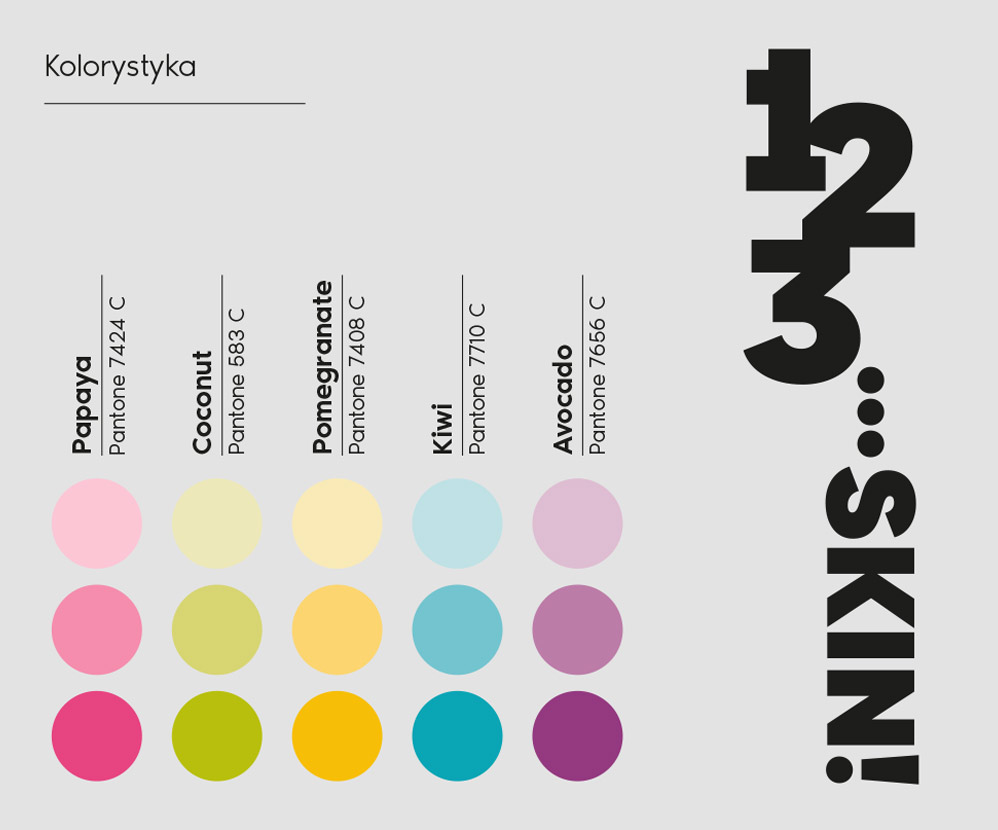
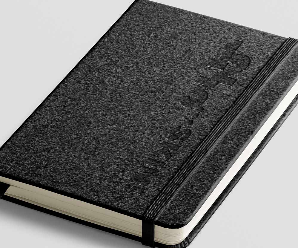
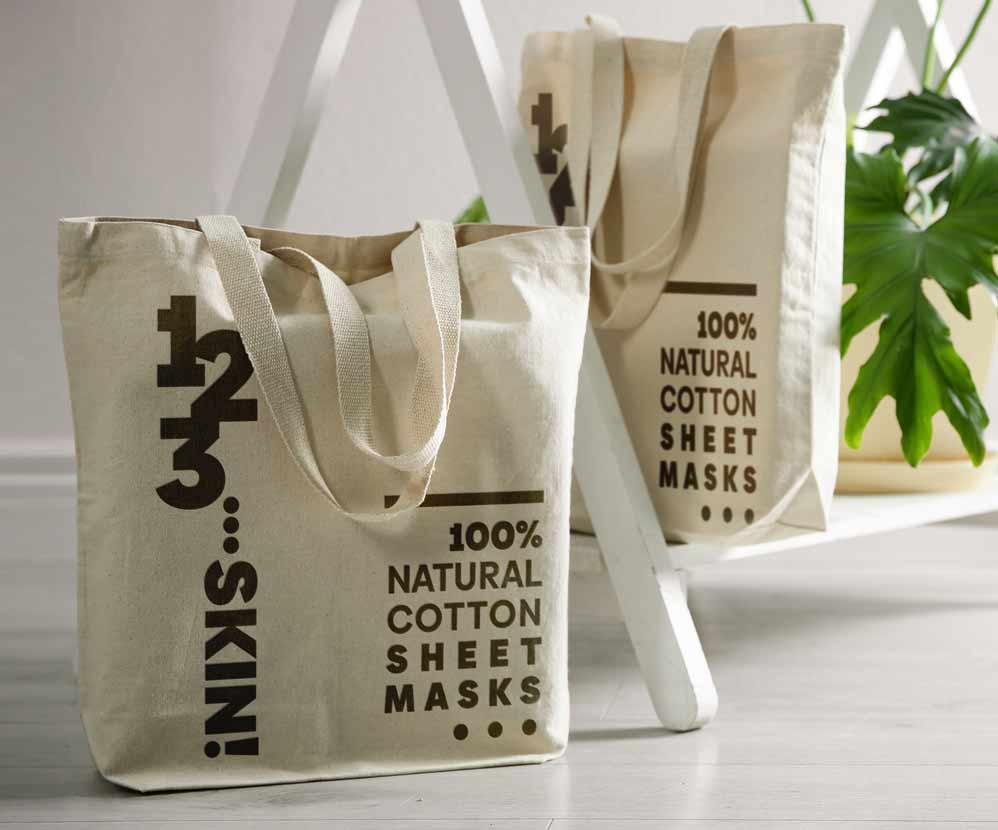
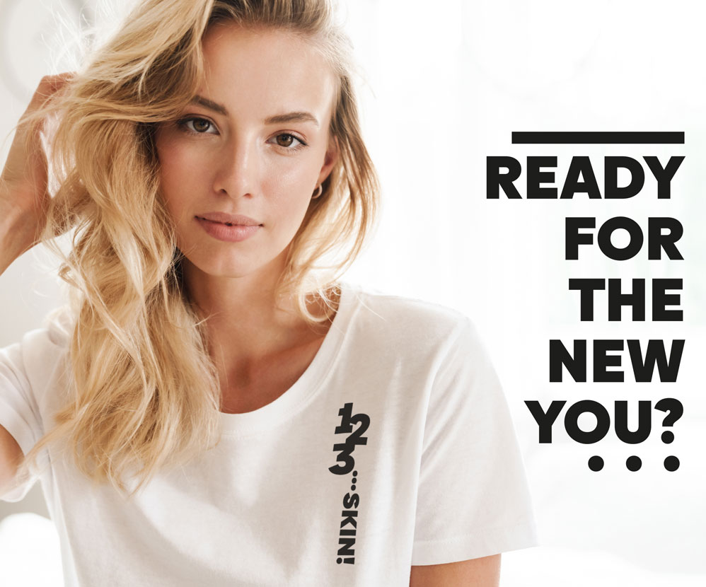
The work also included the design of the brand logo. Due to the specific nature of the packaging, we opted for a vertical logo. This allowed us to divide the packaging in a ratio of one to two, leaving the left side of the design for the most important product differentiators. We also chose basic colors for each package, combining them with photos of individual products, usually based on contrast. We completed the whole branding with various promotional materials: notebooks, bags, t-shirts, and hoodies. This way, we designed a consistent, attractive brand image and prepared it for market success. We also created graphics for social media, building a positive message and evoking warm emotions. Based on photos of women with natural, often unconventional beauty, we emphasized that 1 2 3… SKIN! is for every skin type, for every woman. You don’t have to be perfect to use our products. But you will feel perfect when you do.

Let’s make something great together!
Request a free quote.
Contact
Similar projects
