B-Ro: branding for a food brand
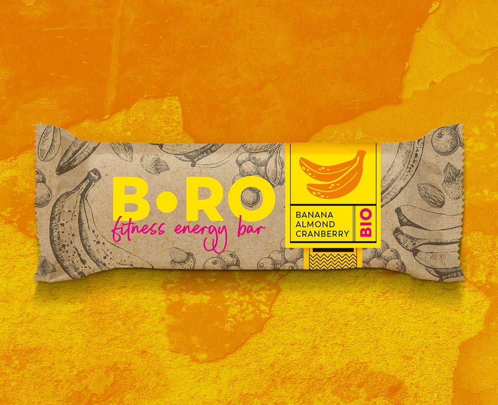
B-Ro is a brand of healthy and tasty snacks—completely plant-based and vegetarian, suitable for vegans. These are natural snacks and smoothies made from carefully selected ingredients. They serve as ideal and satisfying companions for workouts, outings, work, or school. In search of a name, we decided on B-Ro, which, on one hand, refers to the word „bro” (English for brother/buddy), and on the other hand, is an acronym for „Be ROślinny” (Be Plant-Based) – perfectly capturing the brand’s character. To match the defined brand character, we also chose the appropriate language of communication. This includes the words and language used on the packaging, as well as the means of expression, such as the graphic design of the packaging.
Food branding
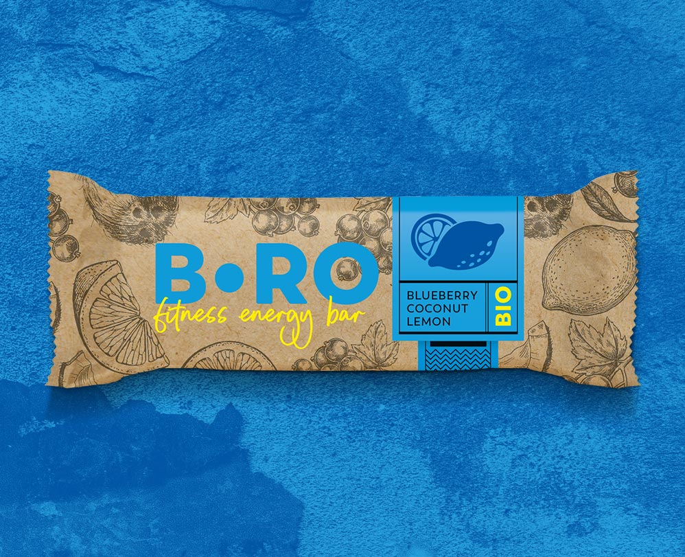
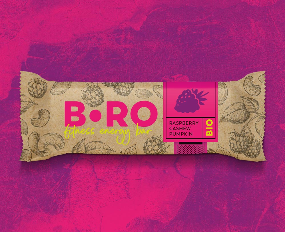
Matte finishes were a natural choice from the beginning. We also incorporated the texture of cardboard, intense additional colors, and clear typography. No unnecessary information on the front of the packaging—just simple communication: brand name, product name, basic ingredients, and information about organic origin.
This allows quick recognition of the product’s main advantages, its key ingredients, and purpose. We removed text from the front until we reached the most satisfying point where eliminating any word would harm the clarity of the message. In other words, we streamlined the content as much as possible. This approach aligns perfectly with the philosophy of the entire B-Ro brand, focusing on being healthy and fit.

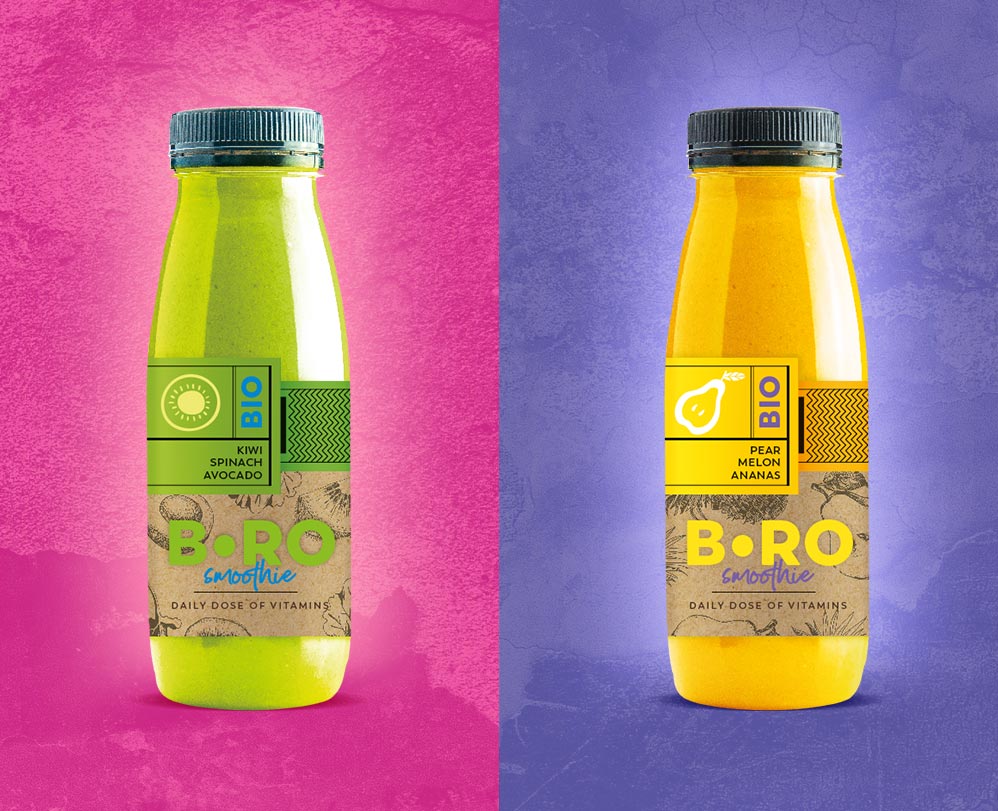
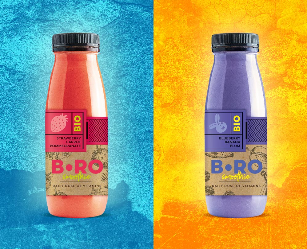
Our work included not only designing packaging for bars and snacks but also labels for beverages. In this case, four flavors of smoothies. The overall aesthetic and energetic presentation of the products on imperfect, uneven, and scratched backgrounds complement the brand’s philosophy.
It was important for us to convey not only the products but also the philosophy behind the B-Ro brand. Hence, the textured backgrounds, which, despite their roughness, are incredibly colorful and perfectly harmonize with the colors present on the packaging itself.
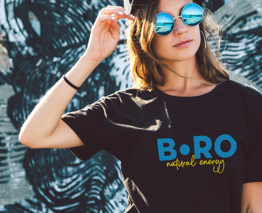
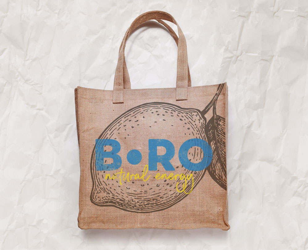
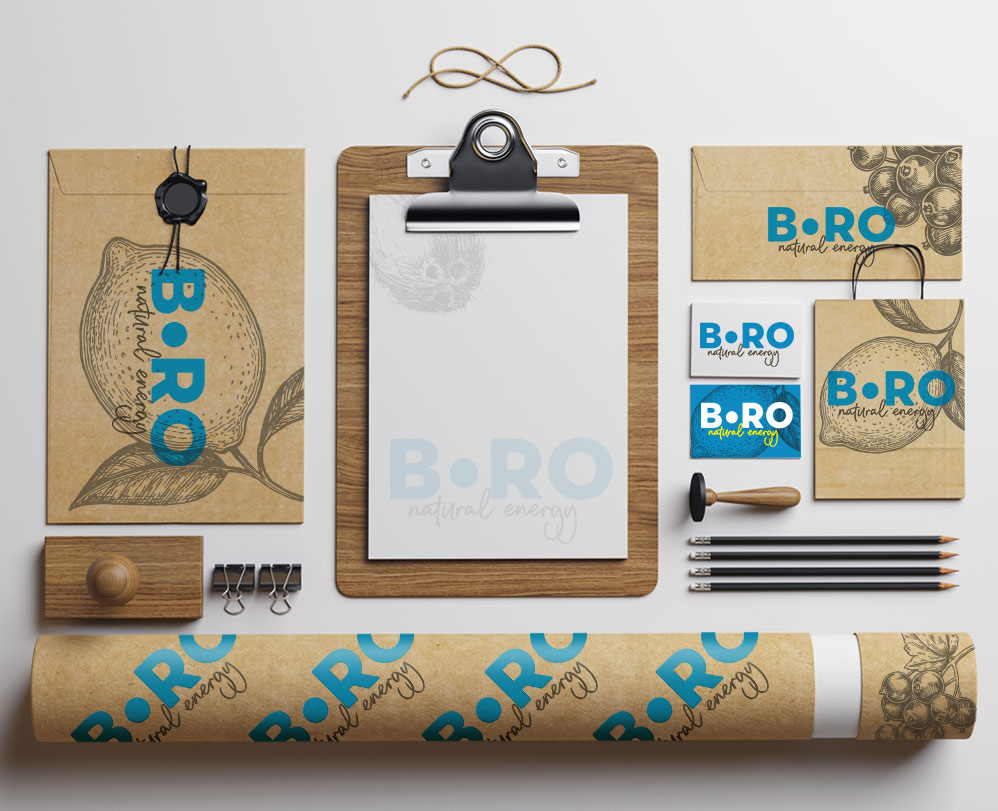
Additionally, we designed a range of other promotional materials, including prints on T-shirts, bags, and stationery items: envelopes, letterhead, business cards, tubes, bags, and more.
In this way, a consistent, distinctive brand was created, possessing its own visual language that perfectly reflects its character and aspirations. This allows for quick engagement with the target audience.
Let’s make something great together!
Request a free quote.
Contact
Similar project
