Toba – coffee packaging
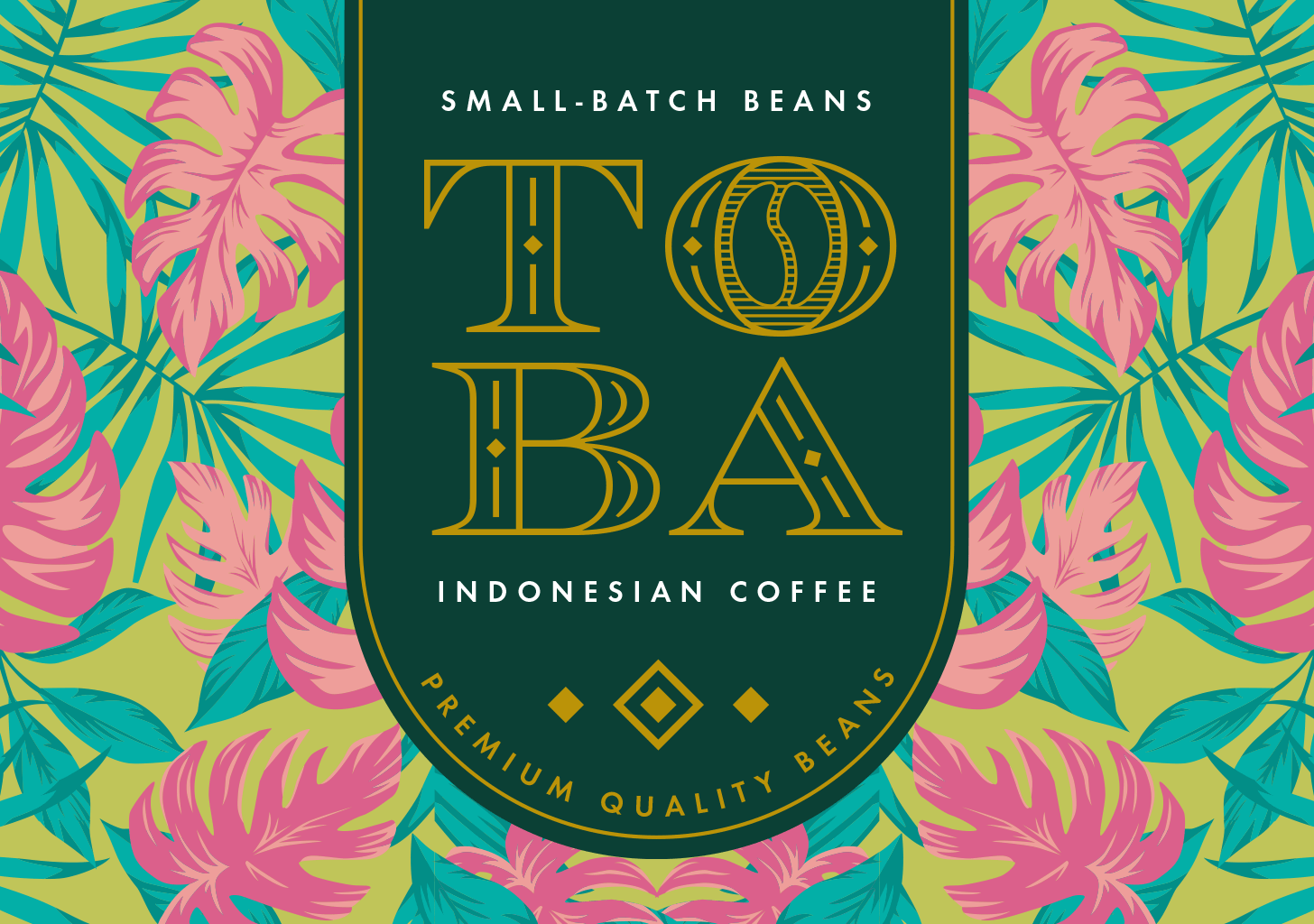
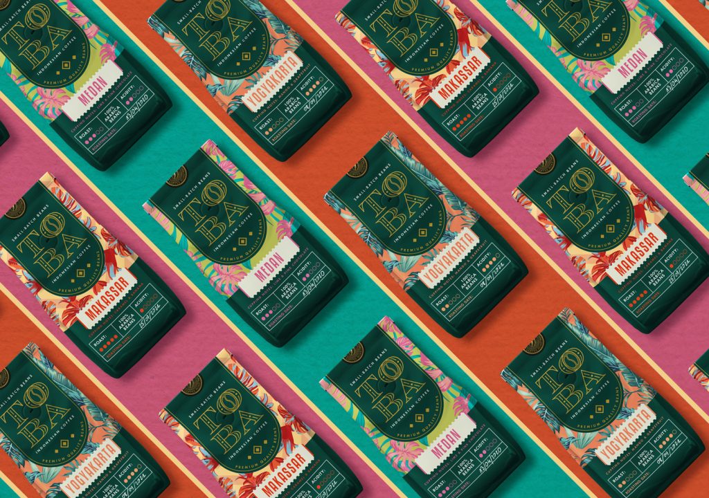
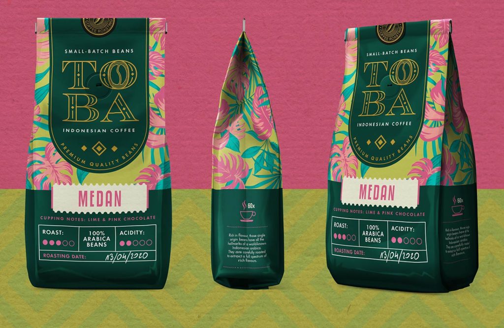
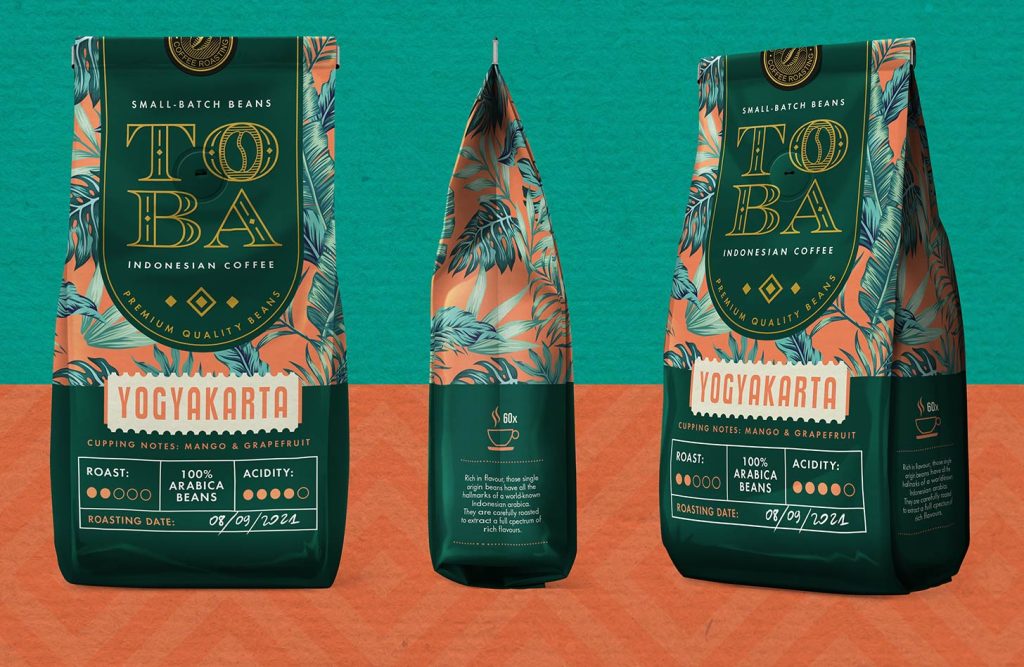
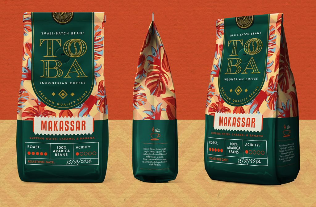
By employing such vivid color schemes, we were able to instantly distinguish between different flavors while maintaining a high level of consistency across the entire product line. At the top of the packaging, you’ll find the prominent product logo along with a description of the brand philosophy: small batches of carefully selected coffee beans from Indonesia. On the bottom of the packaging, we allocated space for product details such as the name, intensity, and roasting date, which can be manually filled in with a white marker.
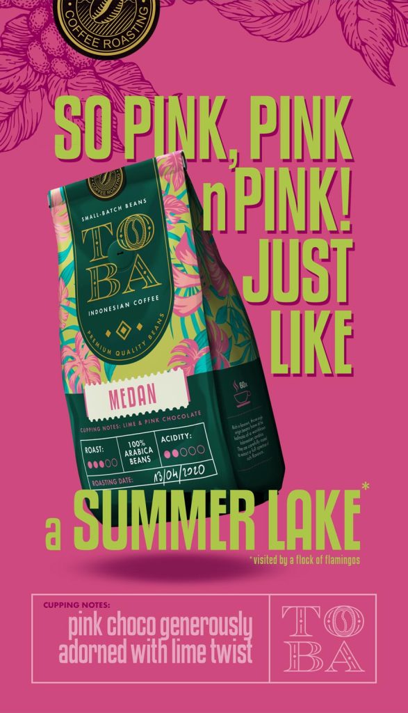
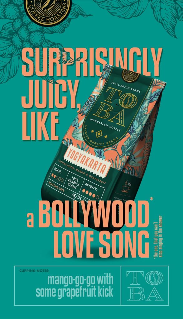
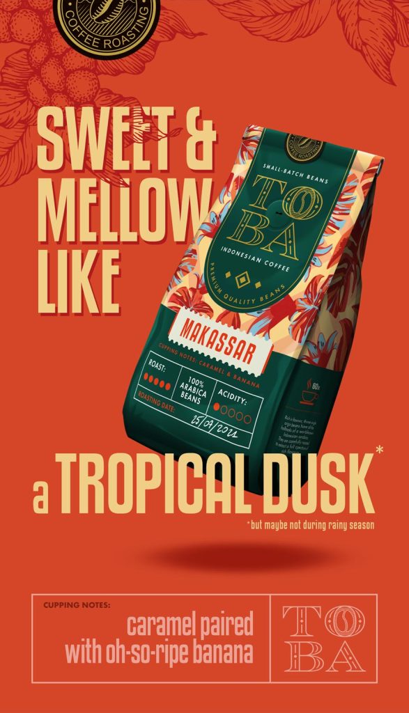
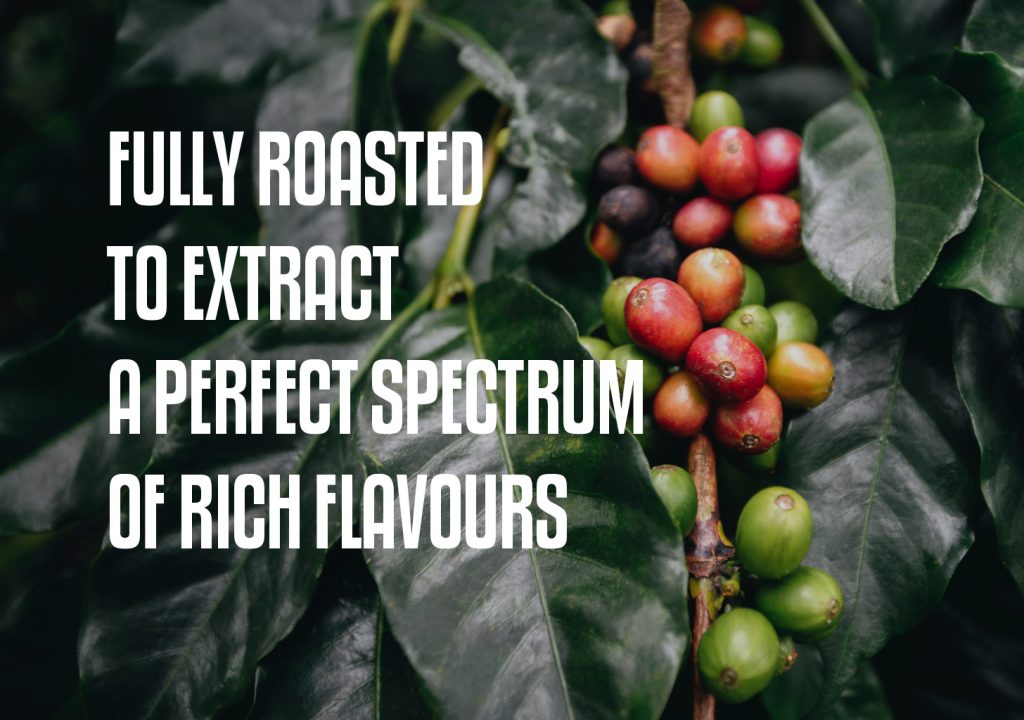
To complement the packaging, we created promotional posters that humorously narrate the product and the experiences derived from it. These posters serve as the foundation for further brand communication, extending to digital creations. In addition to designing the packaging, we’ve developed the entire visual language of the TOBA brand, making it recognizable and visible not only on shelves but also in its communication with customers.

Let’s make something great together!
Request a free quote.
Contact
Similar projects
